
Originally published on GoshenCommons.org September 16, 2013
Last post I focused on the spaces in Chris Ware’s book-in-a-box called “Building Stories,” and the way that those spaces bring the reader into the story. I could write about Ware for the next few months, but for now, since I’ve already made the case that Ware’s work is as significant as literature like “Infinite Jest” and “Remembrance of Things Past,” I’ll discuss his significance within North American visual history, mainly by analyzing his work alongside the landscape paintings of Grant Wood.
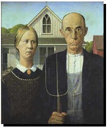
Fuzzy on who Grant Wood is? Here’s his best-known piece, “American Gothic,” from 1930.
(Thanks to Janet Haven and the University of Virginia American Studies program at http://xroads.virginia.edu/~ma98/haven/wood/ for this and other images of Wood’s paintings.)
“American Gothic” may be Wood’s best-known piece, but it’s not especially representative of his work as a whole. It was Ware’s lollipop trees that initially reminded me of Wood’s fish-eye landscapes of the Midwest. Here’s Wood’s 1931 work “Young Corn” next to a below-the-fold page from “Building Stories” that I posted a few weeks back:
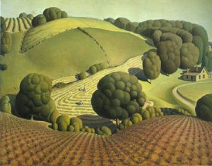
In her overview of the critical interpretation of Grant Wood’s landscapes, Janet Haven writes that unlike European Impressionists like Monet, who still defined the prevailing style favored by the art world in Wood’s time, “Wood ordered the landscape, stylized the hills and trees into his characteristic swellings and ovals, and removed . . . atmospheric effects.” Similarly, a closer look at Chris Ware’s trees reveals tiny scalloped edges, almost fractal, perfectly edged in this almost oppressively organized neighborhood. Ware’s protagonist is running, attempting to “organize” her body into a shape that fits her surroundings. Compare her puffy body to the somber, straight-lined couple in “American Gothic,” who echoed the stern building behind them.
Yet the circle and oval that represent the runner’s head and ponytail from behind almost look more like landscape or architecture than humanity: those two shapes would fit well into a pane of stained-glass in the Frank Lloyd Wright building that she runs past. Contrast the shape of her head and body to the tiny stretched-out figures in “Young Corn” and especially “Birthplace of Herbert Hoover” (1931):
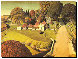
These figures are much different than the people in “American Gothic” and Wood’s other portraits: they seem to be overtaken by the scenery, reduced into the Impressionist brushstrokes that Wood’s landscapes rejected. Is Wood humanizing or dehumanizing these figures? In contrast to much of the art at this time of the Great Depression, in which human figures were sickened by artificial urban light (think Edward Hopper), it seems significant that these figures are light and lithe, more fairy-like than grounded within these landscapes. They become more solid when placed in relation to a building, as in this later painting that echoes, architecturally, “American Gothic”:
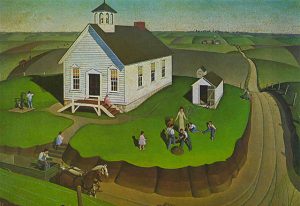
Wood titled this 1932 piece “Arbor Day” with only one tiny tree in sight, which highlights a sense of irony that a lot of his critics missed. Without the overwhelming landscape, these figures are more defined, though still tiny, playful, nostalgic.
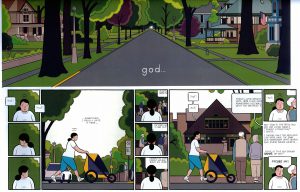
Ware seems to be suggesting something different, for the most dramatic sections of his work feature almost life-sized humans, like the protagonist’s daughter centered on a giant fold-out page:

There’s something real here in this child’s body, the way it provides weight to the page. If you look back at the page from Ware at the top of this post, “god” is an interjection, the protagonist swearing under her breath at tourists blocking the sidewalk. Isolated here below the fold of this also oversized page, however, the word, although lowercase, also becomes a statement of the human struggle for meaning in relation to landscape, architecture and the human history that has shaped and defined both.
As a comics evangelist, part of what I believe is that we live in the real golden age of comics, a time in which this genre has become just as powerful and significant as more highbrow visual arts. Another reason I’m so devoted to this genre is for its multiplicity of voices right now. So, next week: a completely different “voice” in terms of both story and image, the French Ivorian storyteller Marguerite Abouet, with her illustrator Clement Oubrerie, and her collection “Love in Yop City,” the final installment of her “Aya” series, just translated into English. Here’s a still of the main characters from the newly released film version:
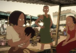
Don’t be fooled by the cartoon-like simplicity of these images. Abouet’s storytelling is often light and funny, but also sweeping, often serious, and not to be underestimated.
Remember where you can find or easily order (free shipping!) any of these books, and see you again in two weeks.