Originally published on GoshenCommons.org November 11, 2013
Last post’s review of “Marble Season” by Gilbert Hernandez was my first write-up of a black and white comic—which made me realize how little I’ve been representing this seminal and diverse world.
Black and white comics are the foundation on which the genre has been built. What most of us define as comics were first published in newspapers before the age of color printing—as well as later, when color printing was expensive and rationed to pages more important than the Sunday “funnies.”
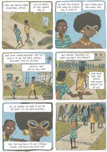
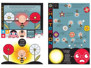
Printing in color has become much more affordable for small presses, a shift in production crucial to the current comics zeitgeist. Many recent comics bestsellers push color to the limits of its possibilities, creating rich, bright and complicated scenes. Here are images from three works I reviewed in earlier posts, Marguerite Abouet’s “Aya” series, illustrated by Clement Oubrerie; Chris Ware’s “Building Stories”; and Lucy Knisley’s “Relish”:
I love seeing these images fight each other and clash a bit when placed next to each other. Their subtle battle emphasizes color comics’ range of possibilities: realistic, geometric, iconic? Earthy tones, bright tones? High contrast, low contrast? The number of choices available to a comics artist working in color can seem overwhelming.
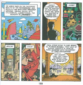
These examples also illustrate Scott McCloud’s argument in “Understanding Comics” that the differences between color and black and white extend beyond visual aesthetics into semantics and meaning. According to McCloud, color comics speak in a language beyond words, a language from childhood, “when shape preceded meaning”:
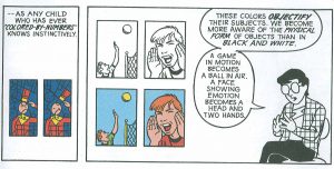
McCloud calls color in comics an objectifying force, which emphasizes objects over scene—as illustrated below, “a ball in air” rather than “a game in motion”:
Color action scenes like the two-page sequence below, from Gene Luen Yang’s “American Born Chinese,” poke holes in McCloud’s argument—clearly, this fight scene is still a “game in motion” rather than a mere collection of individual objects:
Yet McCloud has a point: a splash of color has the capacity to draw the reader’s attention immediately to one part of a frame. Reading black and white comics is usually a slower, more reflective process, closer to interpreting black letters on a white page than to getting visually snagged by a bright orange tiger on a cereal box:
These pages from Adrian Tomine’s “Shortcomings” emphasize the dramatic and interpretive possibilities of contrast, especially against black rather than white.
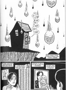
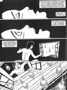
In “Sloth,” Gilbert Hernandez uses the drama of the page turn to further harness the power of contrast. The black slowly takes over, weighting down the first page and seeping into the background of the next as the main character recalls a nightmare.
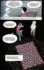
I don’t mean to suggest a rigid dichotomy, however. Color comics run a wide spectrum, and the middle ground can be fascinating in its own right. Artists like Alison Bechdel add a one-color wash to their black and white. Bechdel added blue in her award-winning “Fun Home,” while she added pink in her more recent book, “Are You My Mother?”
Clearly a one-color choice can convey an overall tone for the whole book. The pink in Bechdel’s more recent book is meant to be slightly ironic, using the traditionally “girly” color to echo her difficult relationship with her mother. Yet pink is also warmer, and feels more interior than the cold blue in Fun Home, a book about the parallels between her father’s death and the development of her lesbian identity.
Next week we’ll head into “March: Book One,” written by the civil rights legend John Lewis and his co-writer Andrew Aydin, and illustrated by Nate Powell. “March,” with its wider range of gray tones, represents yet another style of black and white illustration, as well as yet another example of the diversity of storytellers in our current comics renaissance.
Let me know what styles I’ve left out of this brief analysis: browse the comics section downstairs at Better World Books in Goshen, Indiana, and see you in another two weeks.
