Originally published on GoshenCommons.org August 16, 2013
Welcome to the second installment of Commons Comics, a bi-weekly blog sponsored by Better World Books. Stay tuned for my first review—Chris Ware’s “Building Stories”—in the next post. If you’re already familiar with comics and you want some immediate reading suggestions, here are some of the other works released in the past year that I plan to review in the next few months: “Love in Yop City” by Marguerite Abouet, “Marble Season” by Gilbert Hernandez, “Relish” by Lucy Knisley and “March” by John Lewis.
Last week I promised an overview of five categories—moment, frame, image, word and flow—from Scott McCloud’s “Making Comics” (2006) to think about when you read comics. I also got requests from readers for more images, however, so I’ll slow down and start with just one of those five categories, the one that puts the “graphic” in graphic novels: image.
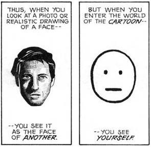
Perhaps the main reason that comics get dismissed as mere kids’ stuff is the simplicity of much of its art. McCloud argues in “Understanding Comics” (1993), however, that it’s precisely that simplicity that gives comics their power. Check out the contrast between these two images:

Continue reading “Reading Comics Images: Simplicity Isn’t Simple”
